 Editor’s Note: The spoilers… the spoilers are taking me to pieces.
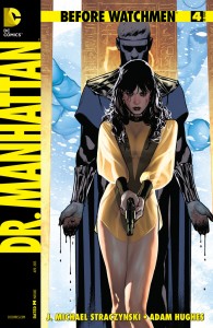
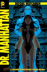
The final issue of Dr. Manhattan, written by J. Michael Straczynski with art by Adam Hughes, extends what is arguably the greatest comic book story of all time, provides additional perspective on one of that classic story’s great mysteries, and it does it with bold storytelling choices, both in the writing and in the art, that play on one of Watchmen‘s original themes of symmetry.
Or, to put it in plainer terms: Dr. Manhattan #4 is fucking awful.
Straczynski uses the framework of Before Watchmen – a book that was partially sold to a seriously skeptical public as a prequel that would not attempt to modify or circumvent Alan Moore’s original Watchmen – to completely blow away one of the key ambiguities of Dr. Manhattan’s story from the original. Further, halfway through the issue, he switches point of view to that of Ozymandias to show his motivations at a key point leading into Watchmen, but not only are they motivations that really have no real bearing on how that story turns out, but they are presented using a visual gimmick that makes the story difficult to read for no reason beyond either Straczynski, or Hughes, or both, making the decision to say, “Lookit me! I’m dicking around with the established language of comic storytelling! Why? Because fuck you, that’s why!”
There are baseball analogies that could be applied to Dr. Manhattan. “Swinging for the fences” is one, although it’s not really accurate. I’m thinking more along the lines of “Running onto the field and mooning the pressbox,” because Straczynski and Hughes are playing around in areas where they shouldn’t really be in the first place, and they’re sure as hell not playing the game by any of the rules that anyone wants them to.
Plus, there’s one panel where Hughes all but rubs our faces in Doc’s dangling blue wang.
It’s really not that good, guys.


 Podcast RSS Feed
 iTunes
 Google Play
 Stitcher
 TuneIn Radio
 Android
 Miro Media Player
 Comics Podcast Network