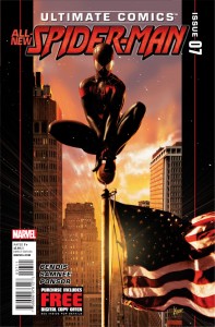
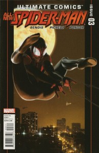
 We’re now seven issues into Brian Michael Bendis’s new Ultimate Spider-Man, and Miles Morales is in his costume, Peter Parker is in his heaven, and there is finally superhero action in this superhero action comic book. Man, I’m liking this book a lot more now that something’s actually happening in it. Who woulda thunk it?
However, the book gets a rough start thanks to Kaare Andrews cover. Sure, it’s beautifully rendered with pseudo 3D / photorealistic backgrounds, and unlike the cover in the last issue we reviewed here, it doesn’t look like Spider-Man’s so excited to have superpowers that he’s double-ejaculating like some kind of pornographic Chow Yun Fat while busily sucking his own dick. No, in this cover, Spider-Man is overlooking the city, demurely and quietly squatting… and apparently crapping a giant golden dook. Right on top of the American flag. Look, I really like Kaare Andrews work – his stuff on Spider-Man: Reign was excellent – but the man draws these Ultimate Spider-Man covers like he’s trying to see what weird shit he can sneak into them. I’m guessing that either we’re two issues away from a cover where Spider-Man sprays webs onto Black Cat’s upper lip, or that I just have a filthy, dirty (sanchez) mind and should stop reading perversion into these covers.
Things, however, are a little more plain vanilla between the covers (Ha! Get it?).

 Podcast RSS Feed
 iTunes
 Google Play
 Stitcher
 TuneIn Radio
 Android
 Miro Media Player
 Comics Podcast Network