 You ever had a low-grade toothache? You know, the kind where you feel a little zip when you suck cold air past it? The kind of thing where you find yourself constantly inhaling sharply, trying to see if maybe its gone away, or if maybe it’s getting worse? And you find yourself worrying that maybe it actually is getting worse, and you just wish the damn thing would go away so you could concentrate on something else?
Over the course of the past year, Scott Lobdell has become my toothache.
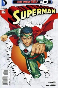
Superman #0 is a pretty bad comic book. It wallows in exposition, alien cliches, and stilted dialogue. It tries to turn Superman’s parents into some kind of asskicking science heroes for some reason, and it implies that Oracle is now some kind of all-knowing, all-seeing space jerk, which should win back all the female readers Lobdell lost with Red Hood and The Outlaws. And it does all this with art that, while pretty enough in a stylized way, serves in places as examples of some of the worst visual storytelling that I have seen in a comic book in 36 years.
Superman #0 made my hangover worse this morning. After reading it I needed to watch my Blu-Ray of The Avengers again too recover any hope for the superhero genre. It made my stool loose and burny. If it had come out two and a half months ago, it would have caused riots in downtown San Diego.
It’s really not very good, you guys.
Being a Zero Issue, Superman #0 endeavors to tell an origin story about its title character, and Lobdell chooses to do that by ignoring Superman completely and focusing on his parents, Jor-El and Lara. Jor-El is the planetary science hero, having discovered the Phantom Zone one evening (apparently Jor-El uses the same drugs that I do) and who now is exploring Krypton’s core in a pressure suit of his own design. So Joe-El is basically Krypton’s James Cameron, only Jor-El’s hot ass-kicking wife didn’t walk out on him in disgust in 1999. Anyway, Jor-El simultaneously discovers that Krypton is on its way to blowing up and a new form of previously unknown indigenous life living beneath the surface, meaning in one day he made career-making breakthroughs in engineering, geology and biology, meaning that somewhere Stephen Hawking is using his voice box to approximate the sound of jealous weeping. So yeah, it turns out that there are elements in Krypton who don’t want the rank and file to know that their planet is doomed, so they stage an attack on Lara an Jor-El to silence them, because apparently it’s just too complicated to go on TV and call them dirty liberals. Then, because the Zero Issues are meant to be self-contained one-and-dones, Lobdell ends the issue with not one, but two cliffhangers.
Okay: so where to begin… let’s start how the issue started: with the exposition. Of which there is a lot. Lobdell makes the choice to open the story with Jor-El, alone, beneath the surface of Krypton. Which is fine, I guess, except that since the New 52 reboot, all we really know about Jor-El is that Superman shot out of the end of his dick somewhere along the line. So Lobdell has, for all intents and purposes, decided to introduce this character by devoting almost a third of the issue to caption boxes and having a character mutter to himself like some kind of a brain-damaged spastic with a taste for overblown monologue (“What started out as mild scientific curiosity — has become a matter of life or death!” Really, Jor-El? What do you shout out while you’re jerking off? “What started out as mild boredom has become a ruined sock”?). It gets the required story points across, but as a storytelling technique, it is fucking boring. It is the antithesis of “show, don’t tell,”
Then there’s the master plan the bad guys have for silencing Jor-El, which doesn’t make any sense at all. We’re given just enough tell-don’t-show exposition to know that they’re working on behalf of The Eradicator on some master plan (One of the bad guys looks directly at the reader and says that’s what they’re doing), but their idea is to hold Lara hostage so Jor-El doesn’t talk about the fact that Krypton is about to take a dirtnap. Which is fine as plans go, except these dingbats already blew up the building that leads to Krypton’s core (although presumably the hole in the ground is still there) and killed a bunch of people… so why not just put a bullet in Jor-El’s skull? No one else knows about Jor-El’s research because he had to dump it to save weight on his ascent from the core – those bits of data and digital pictures sure can become weighty – and they’ve already killed everyone else he talked to, so why not close the loop? My guess? Because if they did that, there wouldn’t be anyone to spit out the tedious exposition we need to know what the hell is going on.
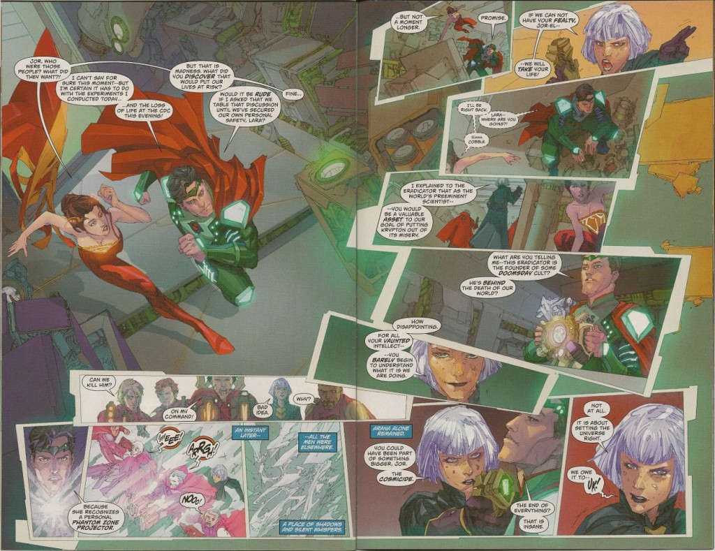
And then there’s the artwork by Kenneth Rocafort, which on one level is pretty cool. He works in a blocky, almost abstract style that looks almost sketched. He does good work depicting alien technology, which is something you want in a book about Krypton, and his use of layout and panel shape is unique… and that’s where he fucks up. Specifically, on story pages 15 and 16, which are laid out like someone with Parkinson’s Disease threw a bunch of drawings on a table.
I mean, look at this shit:
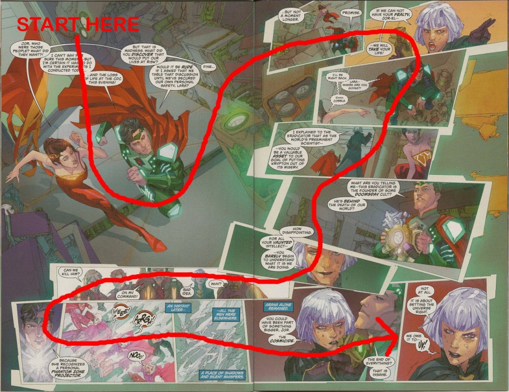
Take a good look at that double-paged spread and tell me how you think you should read it. Is it page one top to bottom and then page two top to bottom? Do you read across the top, then down the right to the bottom, and then to the left? Is it page one to the bottom, then across the bottom to the right and up? Nope, it’s nothing even that counter-intuitive. I read this thing about four times before I figured the pattern out:
Does that make any fucking sense at all? Have you ever seen a comic book page laid out like that? Are there any real cues that the page should be read that way? This is the single worst double-paged spread, from the standpoint of visual storytelling, that I have ever seen. I have been reading comic books, American, English and Japanese, for the past 36 years and it took me literally seven or eight minutes and multiple readings to figure out how to read this page. The rest of the book doesn’t commit sins on the level of these two pages, and it is probably a hell of a thing for me to condemn the art based on just one-tenth of the book, but shit like this matters. The creative team of a comic book owes the reader one thing at a bare minimum, and that is a story that can at least be deciphered. I can put aside the heavy exposition and the stilted dialogue, but I cannot put aside a page that, in the interest of being clever with the layout, is made unreadable. It is a terrible, unforgivable mistake.
In the final analysis, this is a terribly flawed comic book. The story doesn’t make a hell of a lot of sense, the dialogue exists pretty much only to explain what’s happening, and the art commits a storytelling crime that is simply unforgivable. You can go over it and worry at it and poke at it with your tongue, but it won’t stop hurting. Just skip it.


 Podcast RSS Feed
 iTunes
 Google Play
 Stitcher
 TuneIn Radio
 Android
 Miro Media Player
 Comics Podcast Network